Custom Visualizations
Omni supports the most common visualization types and settings out of the box, but can also be heavily customized! We use VegaLite under the hood, which means you can edit and customize the visualization however you'd like by using the Advanced Editor. Check out the full VegaLite spec as well as examples.
Approaching the Vega Editor
Omni defines Vega specification behind all charts. By reaching into the configuration, charts can be tuned to unlock anything available in Vega. Extensive examples are available here.
To reference Omni fields in the Vega spec, periods and brackets need to be escaped. This requires a double forward-slash as follows:
- Omni object --> Vega object
users.id-->users\\.idusers.age-->users\\.ageusers.created_at-->users\\.created_atusers.created_at[date]-->users\\.created_at\\[date\\]users.created_at[month]-->users\\.created_at\\[month\\]id-->idnote 'id' would only occur from a raw SQL query, as Omni will alias with the view
Saving Custom Visualization
To avoid jumpiness on the page, custom visualization need to save explicitly to update the URL (think of edits to the spec as drafts). To save a custom visualization for sharing, simply hit save and the specification will be coupled to the query URL.

Visualization Spec Library
Below, we've included several custom examples of Vega specs in Omni, eventually we'll add links to live examples.
US Map Example (Lat, Long)
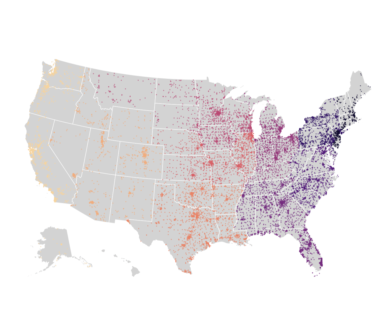
Query Fields:
users.zipusers.zip_first_digitusers.latitude_averageusers.longitude_averageusers.user_count
{
  "layer": [
    {
      "data": {
        "url": "https://vega.github.io/editor/data/us-10m.json",
        "format": {
          "type": "topojson",
          "feature": "states"
        }
      },
      "mark": {
        "fill": "lightgray",
        "type": "geoshape",
        "stroke": "white"
      }
    },
    {
      "mark": {
        "type": "circle",
        "tooltip": true
      },
      "encoding": {
        "size": {
          "value": 5
        },
        "color": {
          "type": "nominal",
          "field": "users\\.zip_first_digit",
          "scale": {
            "scheme": "magma"
          },
          "legend": null
        },
        "latitude": {
          "type": "quantitative",
          "field": "users\\.latitude_average"
        },
        "longitude": {
          "type": "quantitative",
          "field": "users\\.longitude_average"
        }
      }
    }
  ],
  "width": "container",
  "height": "container",
  "projection": {
    "type": "albersUsa"
  }
}
US Map Example (Zip Code Chloropleth)
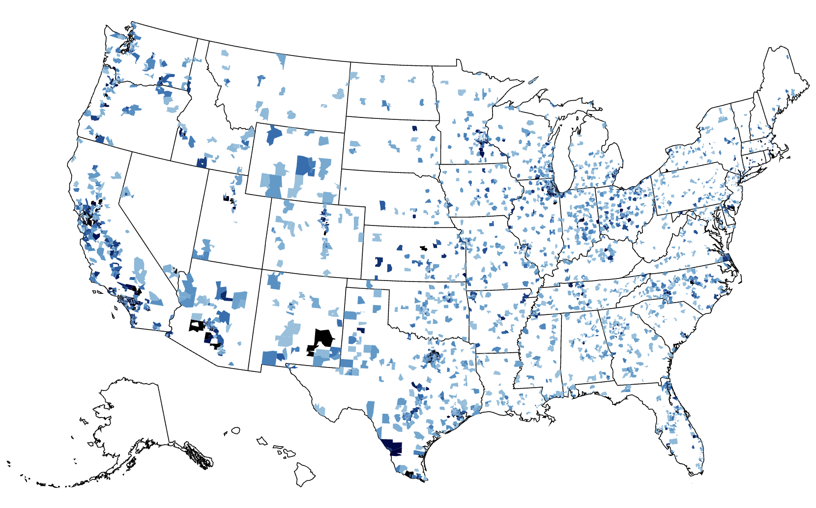
Query Fields:
users.zipusers.user_count
{
  "layer": [
    {
      "data": {
        "url": "https://vega.github.io/editor/data/us-10m.json",
        "format": {
          "type": "topojson",
          "feature": "states"
        }
      },
      "mark": {
        "fill": "white",
        "type": "geoshape",
        "stroke": "black"
      }
    },
    {
      "mark": "geoshape",
      "width": "container",
      "height": "container",
      "encoding": {
        "color": {
          "type": "quantitative",
          "field": "users\\.count",
          "scale": {
            "domain": [
              0,
              20
            ],
            "scheme": "blues"
          },
          "legend": null
        },
        "shape": {
          "type": "geojson",
          "field": "geo"
        },
        "tooltip": [
          {
            "field": "users\\.zip"
          },
          {
            "type": "quantitative",
            "field": "users\\.count",
            "title": "Users Count"
          }
        ]
      }
    }
  ],
  "transform": [
    {
      "as": "geo",
      "from": {
        "key": "properties.zip",
        "data": {
          "url": "https://gist.githubusercontent.com/jefffriesen/6892860/raw/e1f82336dde8de0539a7bac7b8bc60a23d0ad788/zips_us_topo.json",
          "format": {
            "type": "topojson",
            "feature": "zip_codes_for_the_usa"
          }
        }
      },
      "lookup": "users\\.zip"
    }
  ],
  "projection": {
    "type": "albersUsa"
  }
}
Map Example (Zip Code Chloropleth, Washington DC)
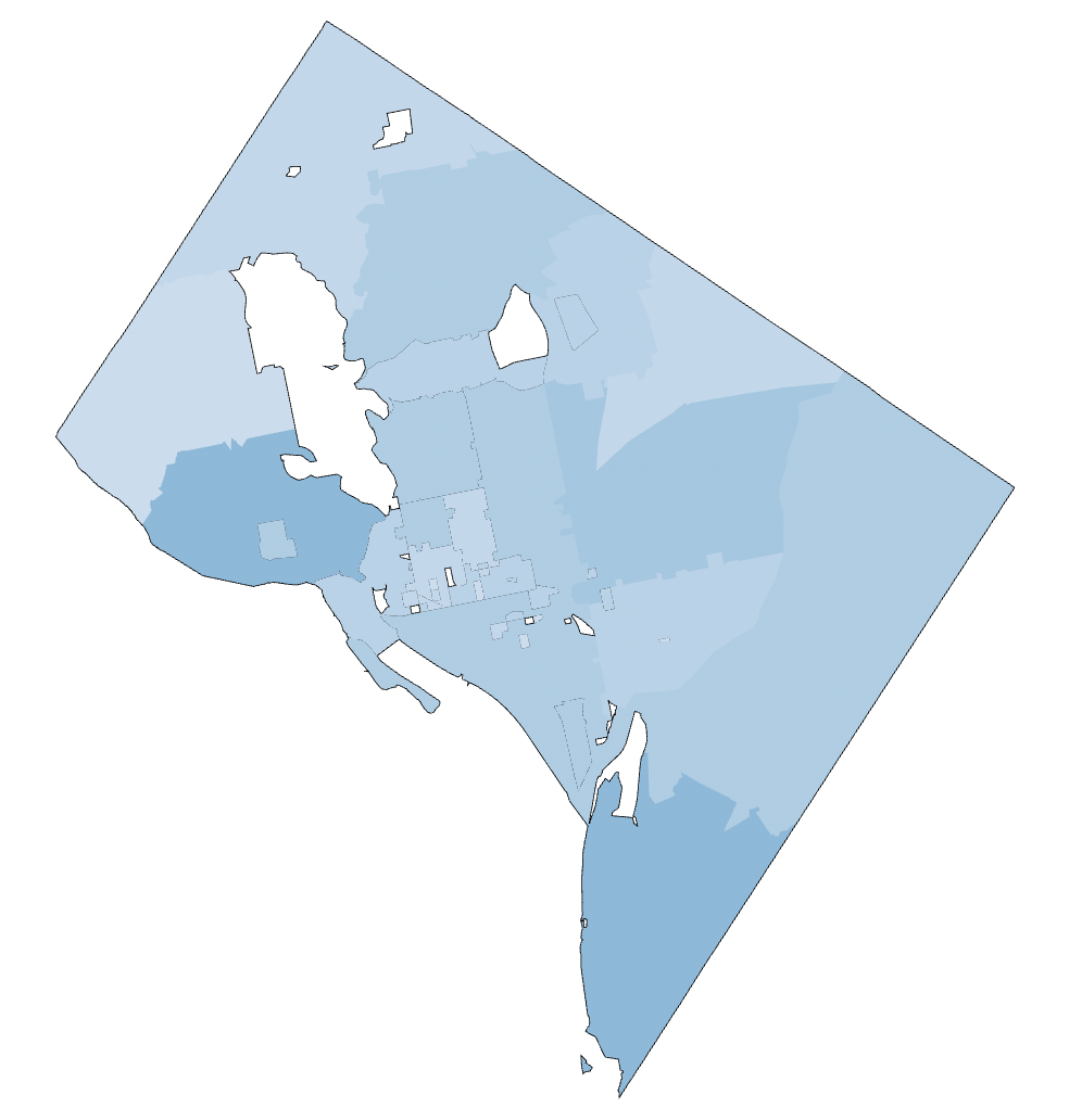
Query Fields:
users.zipusers.user_count
{
  "layer": [
    {
      "data": {
        "url": "https://raw.githubusercontent.com/OpenDataDE/State-zip-code-GeoJSON/master/dc_district_of_columbia_zip_codes_geo.min.json",
        "format": {
          "property": "features"
        }
      },
      "mark": {
        "fill": "white",
        "type": "geoshape",
        "stroke": "black"
      }
    },
    {
      "mark": "geoshape",
      "width": "container",
      "height": "container",
      "encoding": {
        "color": {
          "type": "quantitative",
          "field": "users\\.count",
          "scale": {
            "domain": [
              0,
              20
            ],
            "scheme": "blues"
          },
          "legend": null
        },
        "shape": {
          "type": "geojson",
          "field": "geo"
        },
        "tooltip": [
          {
            "field": "users\\.zip"
          },
          {
            "type": "quantitative",
            "field": "users\\.count",
            "title": "Users Count"
          }
        ]
      }
    }
  ],
  "transform": [
    {
      "as": "geo",
      "from": {
        "key": "properties.ZCTA5CE10",
        "data": {
          "url": "https://raw.githubusercontent.com/OpenDataDE/State-zip-code-GeoJSON/master/dc_district_of_columbia_zip_codes_geo.min.json",
          "format": {
            "property": "features"
          }
        }
      },
      "lookup": "users\\.zip"
    }
  ],
  "projection": {
    "type": "albersUsa"
  }
}
Radial Chart
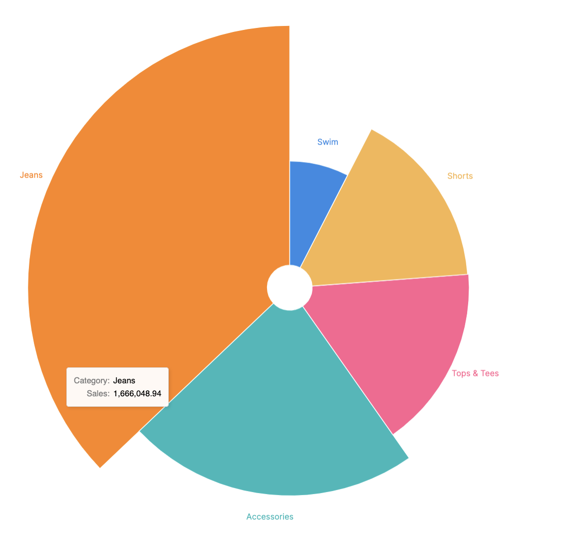
This layers in exploding pie slices using the square root of the value. Mostly of aesthetic style.
Query Fields:
products.categoryorder_items.sale_price_sum
{
  "layer": [
    {
      "mark": {
        "type": "arc",
        "stroke": "#fff",
        "innerRadius": 30
      }
    },
    {
      "mark": {
        "dx": 4,
        "type": "text",
        "align": "center",
        "radiusOffset": 30
      },
      "encoding": {
        "text": {
          "type": "nominal",
          "field": "products\\.category"
        }
      }
    }
  ],
  "height": "container",
  "width": "container",
  "encoding": {
    "color": {
      "type": "nominal",
      "field": "order_items\\.sale_price_sum",
      "legend": null
    },
    "theta": {
      "type": "quantitative",
      "field": "order_items\\.sale_price_sum",
      "stack": true
    },
    "radius": {
      "field": "order_items\\.sale_price_sum",
      "scale": {
        "type": "sqrt",
        "zero": true,
        "rangeMin": 20
      }
    },
    "tooltip": [
      {
        "type": "nominal",
        "field": "products\\.category",
        "title": "Category"
      },
      {
        "type": "quantitative",
        "field": "order_items\\.sale_price_sum",
        "title": "Sales",
        "format": ",.2f"
      }
    ]
  }
}
Cross Filtered Chart Pair
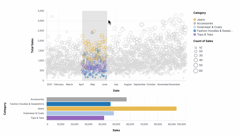
The visualization aggregates the top visualization over the highlight selection. Mainly a proof of concept for highly interactive vis. We essentially build two charts from the data table, stack them, and wire them together. Note also this vis uses pixel sizing, which is not ideal for use on dashboards (where "container" should be used for sizing).
Query Fields:
order_items.created_at[date]filtered to 2021, the x-axisproducts.categoryfiltered to five products, forming the color facetsorder_items.sale_price_sumthe y-axisorder_items.countthe bubble size
{
  "vconcat": [
    {
      "mark": "point",
      "width": 600,
      "height": 300,
      "params": [
        {
          "name": "brush",
          "select": {
            "type": "interval",
            "encodings": [
              "x"
            ]
          }
        }
      ],
      "encoding": {
        "x": {
          "type": "temporal",
          "field": "order_items\\.created_at\\[date\\]__raw",
          "title": "Date"
        },
        "y": {
          "type": "quantitative",
          "field": "order_items\\.sale_price_sum",
          "title": "Total Sales"
        },
        "size": {
          "type": "quantitative",
          "field": "order_items\\.count",
          "title": "Count of Sales"
        },
        "color": {
          "value": "lightgray",
          "condition": {
            "type": "nominal",
            "field": "products\\.category",
            "param": "brush",
            "scale": {
              "range": [
                "#e7ba52",
                "#a7a7a7",
                "#aec7e8",
                "#1f77b4",
                "#9467bd"
              ],
              "domain": [
                "Jeans",
                "Accessories",
                "Outerwear & Coats",
                "Fashion Hoodies & Sweatshirts",
                "Tops & Tees"
              ]
            },
            "title": "Category"
          }
        }
      },
      "transform": [
        {
          "filter": {
            "param": "click"
          }
        }
      ]
    },
    {
      "mark": "bar",
      "width": 600,
      "params": [
        {
          "name": "click",
          "select": {
            "type": "point",
            "encodings": [
              "color"
            ]
          }
        }
      ],
      "encoding": {
        "x": {
          "field": "order_items\\.sale_price_sum",
          "title": "Sales",
          "aggregate": "sum"
        },
        "y": {
          "field": "products\\.category",
          "title": "Category"
        },
        "color": {
          "value": "lightgray",
          "condition": {
            "field": "products\\.category",
            "param": "click",
            "scale": {
              "range": [
                "#e7ba52",
                "#a7a7a7",
                "#aec7e8",
                "#1f77b4",
                "#9467bd"
              ],
              "domain": [
                "Jeans",
                "Accessories",
                "Outerwear & Coats",
                "Fashion Hoodies & Sweatshirts",
                "Tops & Tees"
              ]
            }
          }
        }
      },
      "transform": [
        {
          "filter": {
            "param": "brush"
          }
        }
      ]
    }
  ]
}
Flag Marks Scatterplot
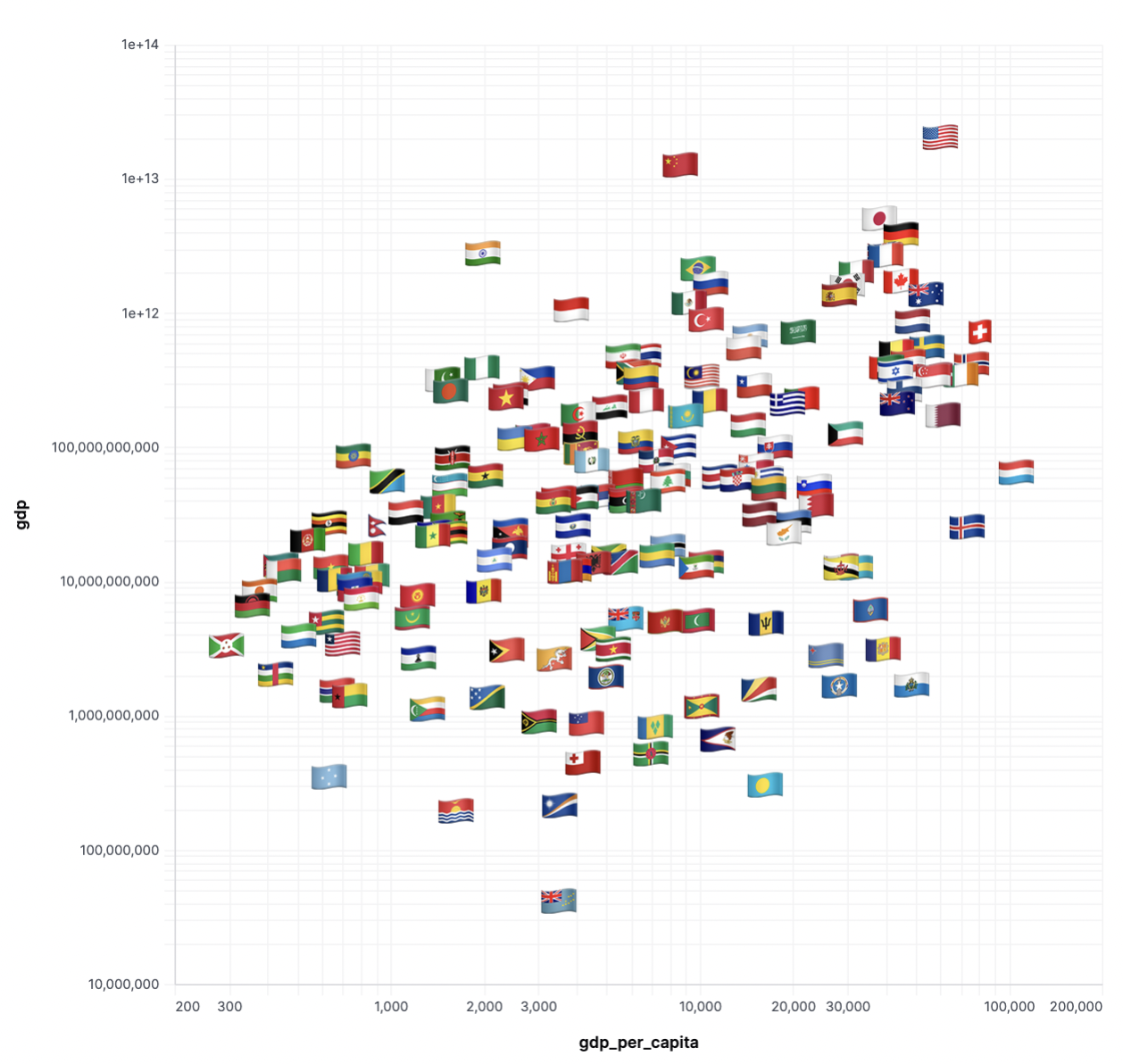
The chart uses data about each country's economy, along with emojis representing the flag. There are several other measures available that are not visualized in the chart. Here we are simply swapping the mark for text (the emoji), and created a normal scatterplot otherwise. We also have some small transformations on the axes to use log-scale.
Query Fields:
flagname(country name)rankgdpgrowthpopulationgdp_per_capitagdp_percent_share
{
  "mark": {
    "type": "text",
    "fontSize": 30
  },
  "width": "container",
  "height": "container",
  "encoding": {
    "x": {
      "type": "quantitative",
      "field": "gdp_per_capita",
      "scale": {
        "type": "log",
        "domain": [
          200,
          200000
        ]
      }
    },
    "y": {
      "axis": {
        "labelOverlap": true
      },
      "type": "quantitative",
      "field": "gdp",
      "scale": {
        "type": "log"
      }
    },
    "text": {
      "type": "nominal",
      "field": "flag"
    },
    "tooltip": [
      {
        "sort": null,
        "type": "nominal",
        "field": "flag"
      },
      {
        "sort": null,
        "type": "nominal",
        "field": "name",
        "title": "country"
      },
      {
        "sort": null,
        "type": "quantitative",
        "field": "gdp"
      },
      {
        "type": "quantitative",
        "field": "gdp_per_capita"
      }
    ]
  }
}
Waterfall
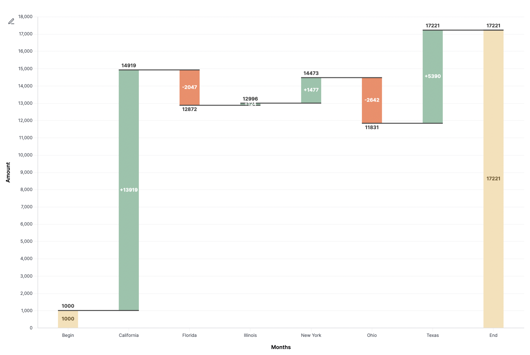
This chart requires both a custom visualization spec and some query munging. We can probably make this a bit simpler, but it's instructive for now on how flexible querying plus custom vis can be. Here we simulate some change data state by state and then append special bars for the start and finish values. This can probably become dynamic in the future. The data is mashed together via a simple SQL union. Note there is also quite a bit of calculation in the Vega spec, showing the ability to extend the basic data set to enhance the vis.
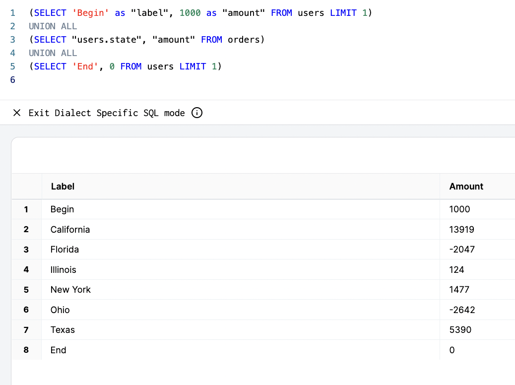
Query Fields:
labelvalue
Unioned Queries
- Begin row: start value, must be named 'Begin' for label, this can be replaced with the first value from the data set in the future
- Waterfall data set: usually easiest to build with UI and drop in the SQL or via a SQL block
- End row: value must be 0, must be named 'End', this can be replaced in the future since it's all implied
{
  "layer": [
    {
      "mark": {
        "size": 45,
        "type": "bar"
      },
      "encoding": {
        "y": {
          "type": "quantitative",
          "field": "previous_sum",
          "title": "Amount"
        },
        "y2": {
          "field": "sum"
        },
        "color": {
          "value": "#93c4aa",
          "condition": [
            {
              "test": "datum.label === 'Begin' || datum.label === 'End'",
              "value": "#f7e0b6"
            },
            {
              "test": "datum.sum < datum.previous_sum",
              "value": "#f78a64"
            }
          ]
        }
      }
    },
    {
      "mark": {
        "type": "rule",
        "color": "#404040",
        "opacity": 1,
        "xOffset": -22.5,
        "x2Offset": 22.5,
        "strokeWidth": 2
      },
      "encoding": {
        "y": {
          "type": "quantitative",
          "field": "sum"
        },
        "x2": {
          "field": "lead"
        }
      }
    },
    {
      "mark": {
        "dy": -4,
        "type": "text",
        "baseline": "bottom"
      },
      "encoding": {
        "y": {
          "type": "quantitative",
          "field": "sum_inc"
        },
        "text": {
          "type": "nominal",
          "field": "sum_inc"
        }
      }
    },
    {
      "mark": {
        "dy": 4,
        "type": "text",
        "baseline": "top"
      },
      "encoding": {
        "y": {
          "type": "quantitative",
          "field": "sum_dec"
        },
        "text": {
          "type": "nominal",
          "field": "sum_dec"
        }
      }
    },
    {
      "mark": {
        "type": "text",
        "baseline": "middle",
        "fontWeight": "bold"
      },
      "encoding": {
        "y": {
          "type": "quantitative",
          "field": "center"
        },
        "text": {
          "type": "nominal",
          "field": "text_amount"
        },
        "color": {
          "value": "white",
          "condition": [
            {
              "test": "datum.label === 'Begin' || datum.label === 'End'",
              "value": "#725a30"
            }
          ]
        }
      }
    }
  ],
  "width": "container",
  "config": {
    "text": {
      "color": "#404040",
      "fontWeight": "bold"
    }
  },
  "height": "container",
  "encoding": {
    "x": {
      "axis": {
        "title": "Months",
        "labelAngle": 0
      },
      "sort": null,
      "type": "ordinal",
      "field": "label"
    }
  },
  "transform": [
    {
      "window": [
        {
          "as": "sum",
          "op": "sum",
          "field": "amount"
        }
      ]
    },
    {
      "window": [
        {
          "as": "lead",
          "op": "lead",
          "field": "label"
        }
      ]
    },
    {
      "as": "lead",
      "calculate": "datum.lead === null ? datum.label : datum.lead"
    },
    {
      "as": "previous_sum",
      "calculate": "datum.label === 'End' ? 0 : datum.sum - datum.amount"
    },
    {
      "as": "amount",
      "calculate": "datum.label === 'End' ? datum.sum : datum.amount"
    },
    {
      "as": "text_amount",
      "calculate": "(datum.label !== 'Begin' && datum.label !== 'End' && datum.amount > 0 ? '+' : '') + datum.amount"
    },
    {
      "as": "center",
      "calculate": "(datum.sum + datum.previous_sum) / 2"
    },
    {
      "as": "sum_dec",
      "calculate": "datum.sum < datum.previous_sum ? datum.sum : ''"
    },
    {
      "as": "sum_inc",
      "calculate": "datum.sum > datum.previous_sum ? datum.sum : ''"
    }
  ]
}
Boxplot
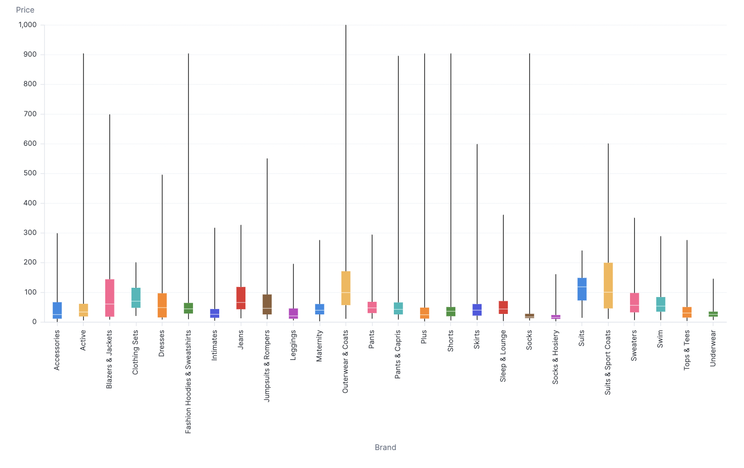
Boxplot is calculated using the distribution over a data set, so in this example, we actually upped the row limit to 50k results using SQL. Our example has several retail categories and the prices of goods in each category. The plot then build some summary statistics over the distribution of each category.
Query Fields:
categoryretail_price
{
  "mark": {
    "type": "boxplot",
    "extent": "min-max"
  },
  "width": "container",
  "height": "container",
  "encoding": {
    "x": {
      "axis": {
        "title": "Brand"
      },
      "type": "ordinal",
      "field": "products\\.category"
    },
    "y": {
      "axis": {
        "title": "Price"
      },
      "type": "quantitative",
      "field": "products.retail_price"
    },
    "color": {
      "type": "nominal",
      "field": "products\\.category",
      "legend": null
    }
  }
}
Heatmap
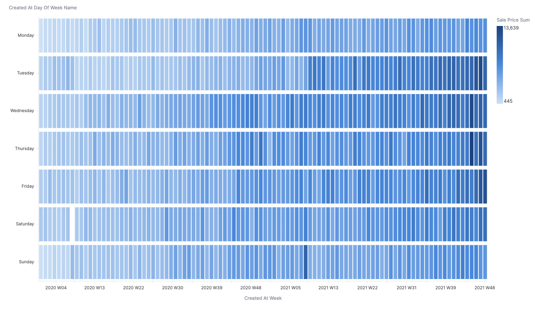
This chart is actually out of the box, but can be tricky, so we're including it here. To build this heatmap, simply add dimensions to both X and Y axes, using your measure in color. In this case week is on the X-axis, and day of week is on the Y-axis, with sales on color.
Query Fields:
weekday_of_weeksales_price_sum
Funnel Vis
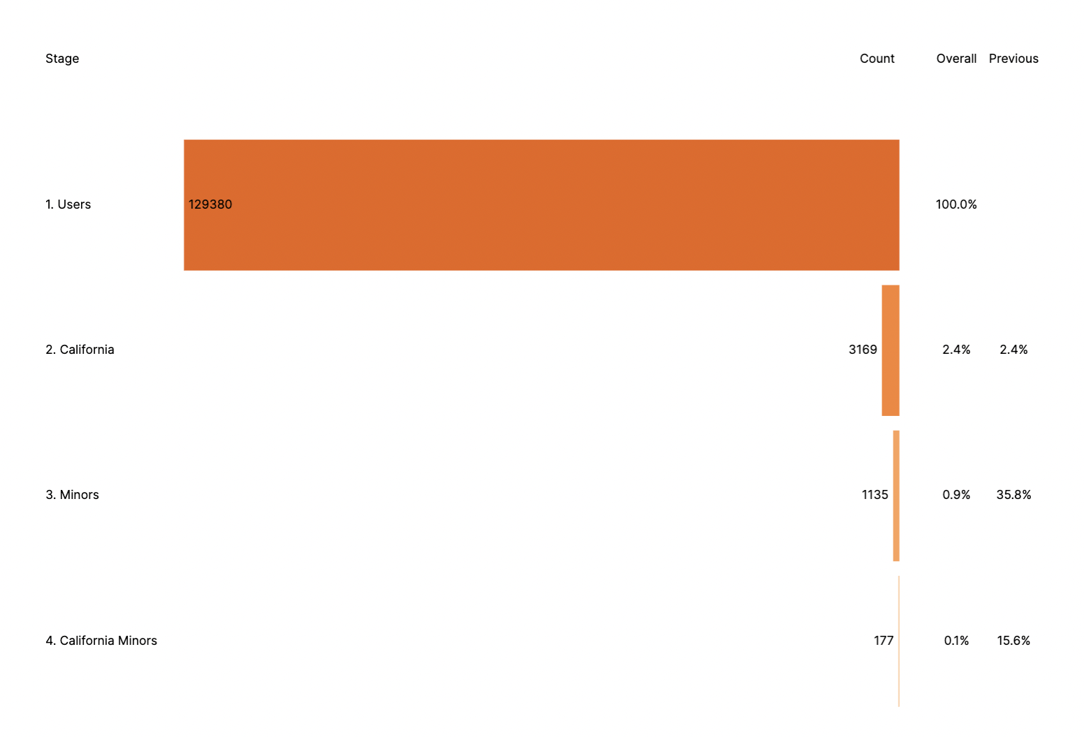
This chart is for measuring a funnel with several filtered measures. It calculates both overall drop-off and step-by-step dropoff. The vis can be tweaked to more or fewer stages by editing the fold section and then the subsequent steps below, removing the backticks - ie. users\\.count then "measurename": "users.count".
Query Fields:
users.countusers.count_california_seniorsusers.count_minorsusers.count_california_minors
{
  "layer": [
    {
      "mark": {
        "type": "bar",
        "color": "transparent"
      },
      "encoding": {
        "x": {
          "axis": "",
          "type": "quantitative",
          "field": "stagePos"
        }
      }
    },
    {
      "mark": {
        "type": "bar",
        "tooltip": true
      },
      "encoding": {
        "x": {
          "axis": "",
          "type": "quantitative",
          "field": "negCount"
        },
        "color": {
          "field": "stage",
          "scale": {
            "scheme": {
              "name": "oranges",
              "extent": [
                0.8,
                0
              ]
            }
          },
          "legend": null
        },
        "tooltip": [
          {
            "type": "nominal",
            "field": "stage",
            "title": "Stage"
          },
          {
            "type": "quantitative",
            "field": "count",
            "title": "Count"
          }
        ]
      }
    },
    {
      "mark": {
        "dx": {
          "expr": "datum.labelLeft ? -4 : 4"
        },
        "type": "text",
        "align": {
          "expr": "datum.labelLeft ? 'right' : 'left'"
        }
      },
      "encoding": {
        "x": {
          "axis": "",
          "type": "quantitative",
          "field": "negCount"
        },
        "text": {
          "field": "count"
        }
      }
    },
    {
      "mark": {
        "dx": 4,
        "type": "text",
        "align": "left"
      },
      "encoding": {
        "x": {
          "axis": "",
          "type": "quantitative",
          "field": "stagePos"
        },
        "text": {
          "field": "stage"
        }
      }
    },
    {
      "mark": {
        "type": "text",
        "align": "center"
      },
      "encoding": {
        "x": {
          "axis": "",
          "type": "quantitative",
          "field": "cumulativePos"
        },
        "text": {
          "field": "cumulativePct",
          "format": ".1%"
        }
      }
    },
    {
      "mark": {
        "type": "text",
        "align": "center"
      },
      "encoding": {
        "x": {
          "axis": "",
          "type": "quantitative",
          "field": "conversionPos"
        },
        "text": {
          "field": "conversionPct",
          "format": ".1%"
        }
      },
      "transform": [
        {
          "filter": "isValid(datum.previousCount)"
        }
      ]
    },
    {
      "mark": {
        "dx": {
          "expr": "datum.dx"
        },
        "type": "text",
        "align": {
          "expr": "datum.align"
        }
      },
      "encoding": {
        "x": {
          "axis": "",
          "type": "quantitative",
          "field": "pos"
        },
        "y": {
          "axis": null,
          "type": "nominal",
          "datum": "0. Titles"
        },
        "text": {
          "field": "caption"
        }
      },
      "transform": [
        {
          "filter": "!isValid(datum.previousCount)"
        },
        {
          "as": "zero",
          "calculate": "0"
        },
        {
          "as": [
            "column",
            "pos"
          ],
          "fold": [
            "stagePos",
            "zero",
            "cumulativePos",
            "conversionPos"
          ]
        },
        {
          "from": {
            "key": "column",
            "data": {
              "values": [
                {
                  "dx": 4,
                  "align": "left",
                  "column": "stagePos",
                  "caption": "Stage"
                },
                {
                  "dx": -4,
                  "align": "right",
                  "column": "zero",
                  "caption": "Count"
                },
                {
                  "dx": 0,
                  "align": "center",
                  "column": "cumulativePos",
                  "caption": "Overall"
                },
                {
                  "dx": 0,
                  "align": "center",
                  "column": "conversionPos",
                  "caption": "Previous"
                }
              ]
            },
            "fields": [
              "caption",
              "align",
              "dx"
            ]
          },
          "lookup": "column"
        }
      ]
    }
  ],
  "width": "container",
  "height": "container",
  "encoding": {
    "y": {
      "axis": "",
      "type": "nominal",
      "field": "stage"
    }
  },
  "transform": [
    {
      "as": [
        "measurename",
        "count"
      ],
      "fold": [
        "users\\.count",
        "users\\.count_california_seniors",
        "users\\.count_minors",
        "users\\.count_california_minors"
      ]
    },
    {
      "from": {
        "key": "measurename",
        "data": {
          "values": [
            {
              "stage": "1. Users",
              "measurename": "users.count"
            },
            {
              "stage": "2. California ",
              "measurename": "users.count_california_seniors"
            },
            {
              "stage": "3. Minors",
              "measurename": "users.count_minors"
            },
            {
              "stage": "4. California Minors",
              "measurename": "users.count_california_minors"
            }
          ]
        },
        "fields": [
          "stage"
        ]
      },
      "lookup": "measurename"
    },
    {
      "joinaggregate": [
        {
          "as": "maxCount",
          "op": "max",
          "field": "count"
        }
      ]
    },
    {
      "sort": [
        {
          "field": "stage",
          "order": "ascending"
        }
      ],
      "window": [
        {
          "as": "previousCount",
          "op": "lag",
          "field": "count"
        }
      ]
    },
    {
      "as": "cumulativePct",
      "calculate": "datum.count / datum.maxCount"
    },
    {
      "as": "conversionPct",
      "calculate": "datum.count / datum.previousCount"
    },
    {
      "as": "countPos",
      "calculate": "datum.maxCount * 0.5"
    },
    {
      "as": "cumulativePos",
      "calculate": "datum.maxCount * 0.08"
    },
    {
      "as": "conversionPos",
      "calculate": "datum.maxCount * 0.16"
    },
    {
      "as": "stagePos",
      "calculate": "datum.maxCount * -1.2"
    },
    {
      "as": "negCount",
      "calculate": "-datum.count"
    },
    {
      "as": "labelLeft",
      "calculate": "datum.count < 0.1 * datum.maxCount"
    }
  ]
}
Gantt Charts (Timeline Charts)
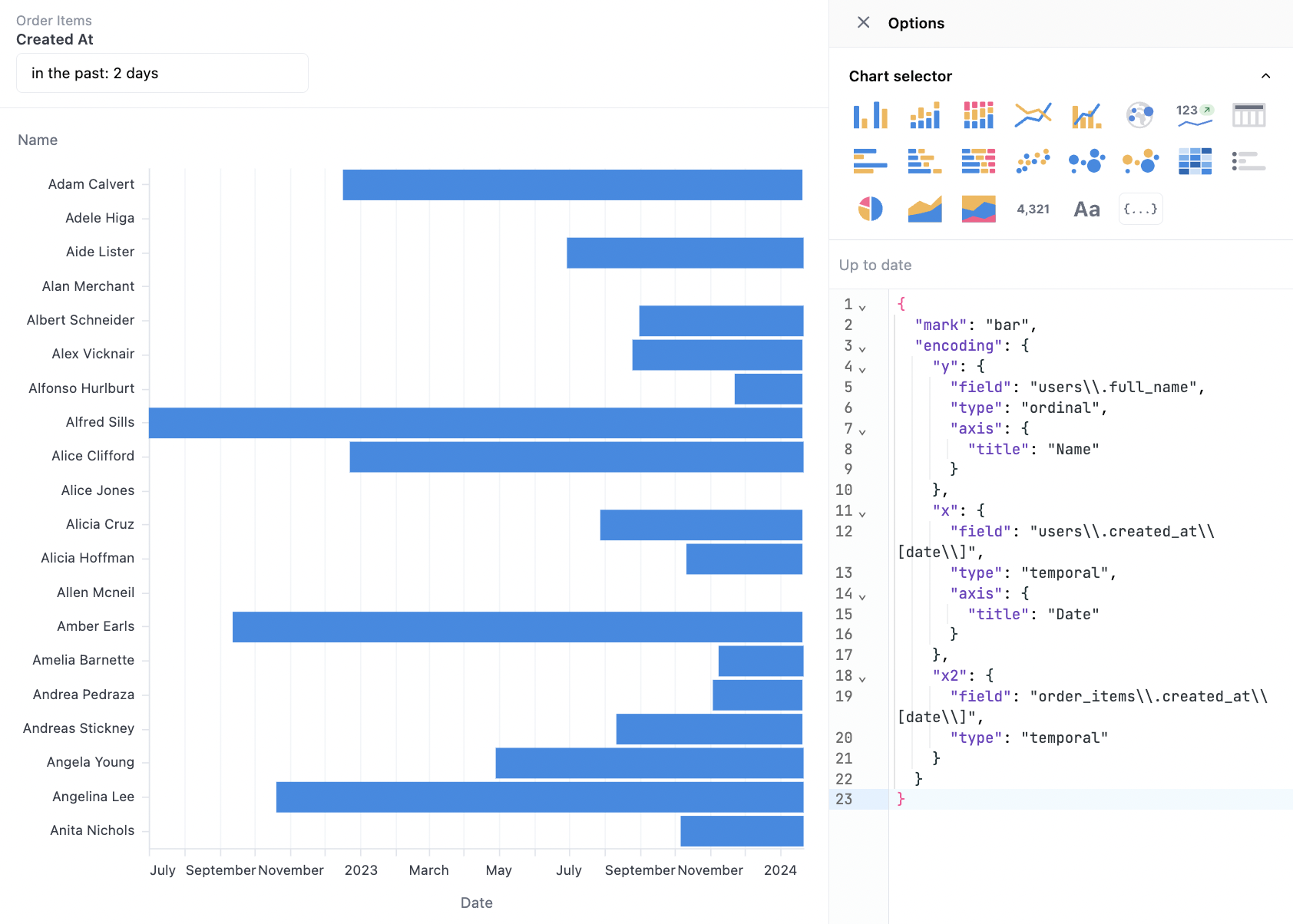
This chart takes advantage of x, x2 in Vega to create a start and end point for bars along a timeline for each user. It also includes a small bit of config to improve the axis labels. Color could be including in an additional facet, using one more dimension to group different users together.
Query Fields:
users.full_nameusers.created_at[date]order_items.created_at[date]
{
  "mark": "bar",
  "encoding": {
    "y": {
      "field": "users\\.full_name",
      "type": "ordinal",
      "axis": {
        "title": "Name"
      }
    },
    "x": {
      "field": "users\\.created_at\\[date\\]",
      "type": "temporal",
      "axis": {
        "title": "Date"
      }
    },
    "x2": {
      "field": "order_items\\.created_at\\[date\\]",
      "type": "temporal"
    }
  }
}
Isotope Visualization (Stacked Icons)
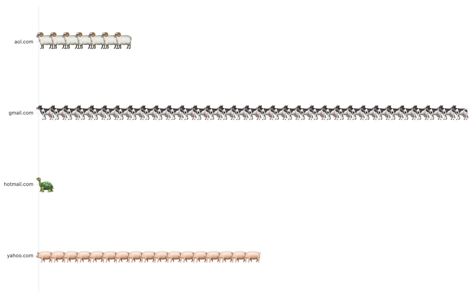
This chart is a bit different than most because it needs the full granularity in the data set to create the stacked icons. There are likely more intelligent ways to build this on top of grouped data, but out of scope with this example. This example is also contrived and grouped email domains with icons. The core technique is mapping the repeated values into icons, then stacking them. Note that users.id is included in order to create one entry per row.
Query Fields:
users.email_domainusers.id
{
  "mark": {
    "type": "text",
    "baseline": "middle"
  },
  "width": "container",
  "config": {
    "view": {
      "stroke": ""
    }
  },
  "height": "container",
  "encoding": {
    "x": {
      "axis": null,
      "type": "ordinal",
      "field": "rank"
    },
    "y": {
      "type": "nominal",
      "field": "users\\.email_domain",
      "title": null
    },
    "size": {
      "value": 40
    },
    "text": {
      "type": "nominal",
      "field": "emoji"
    }
  },
  "transform": [
    {
      "as": "emoji",
      "calculate": "{'gmail.com': '🐄', 'aol.com': '🐏', 'yahoo.com': '🐖', 'hotmail.com': '🐢'}[datum['users\\.email_domain']]"
    },
    {
      "window": [
        {
          "as": "rank",
          "op": "rank"
        }
      ],
      "groupby": [
        "users\\.email_domain"
      ]
    }
  ]
}
Gauge Visualization
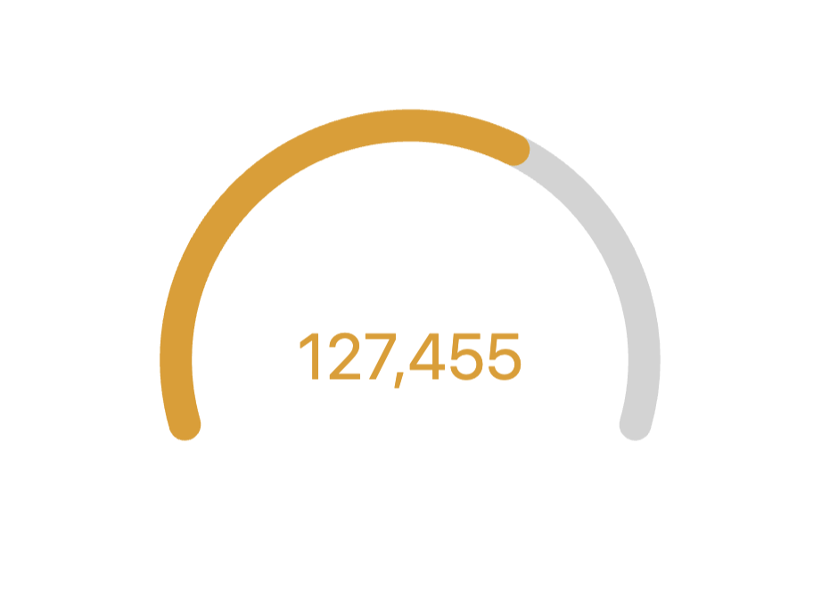
{
  "layer": [
    {
      "mark": {
        "type": "arc",
        "color": "lightgrey",
        "theta": {
          "expr": "datum['_arc_start_radians']"
        },
        "radius": {
          "expr": "ring1_outer"
        },
        "theta2": {
          "expr": "datum['_arc_end_radians']"
        },
        "radius2": {
          "expr": "ring1_inner"
        },
        "cornerRadius": 10
      }
    },
    {
      "mark": {
        "type": "arc",
        "theta": {
          "expr": "datum['_ring_start_radians']"
        },
        "radius": {
          "expr": "ring1_outer"
        },
        "theta2": {
          "expr": "datum['_ring_end_radians']"
        },
        "radius2": {
          "expr": "ring1_inner"
        },
        "cornerRadius": 10
      },
      "name": "RING",
      "encoding": {
        "color": {
          "value": "#307E31",
          "condition": [
            {
              "test": "datum['ratio'] < 0.33",
              "value": "#880808"
            },
            {
              "test": "datum['ratio'] < 0.66",
              "value": "#E49B0F"
            }
          ]
        }
      }
    },
    {
      "mark": {
        "type": "text",
        "fontSize": 40
      },
      "encoding": {
        "text": {
          "field": "users\\.count",
          "format": "number",
          "formatType": "omniNumberFormat"
        },
        "color": {
          "value": "#307E31",
          "condition": [
            {
              "test": "datum['ratio'] < 0.33",
              "value": "#880808"
            },
            {
              "test": "datum['ratio'] < 0.66",
              "value": "#E49B0F"
            }
          ]
        }
      }
    }
  ],
  "width": "container",
  "config": {
    "concat": {
      "spacing": 0
    },
    "autosize": {
      "type": "fit",
      "resize": true,
      "contains": "padding"
    }
  },
  "height": "container",
  "params": [
    {
      "name": "ring_max",
      "value": 160
    },
    {
      "name": "ring_width",
      "value": 20
    },
    {
      "name": "ring_gap",
      "value": 5
    },
    {
      "name": "label_color",
      "value": "#000000"
    },
    {
      "name": "ring_background_opacity",
      "value": 0.3
    },
    {
      "name": "ring0_percent",
      "value": 100
    },
    {
      "expr": "ring_max+2",
      "name": "ring0_outer"
    },
    {
      "expr": "ring_max+1",
      "name": "ring0_inner"
    },
    {
      "expr": "ring0_inner-ring_gap",
      "name": "ring1_outer"
    },
    {
      "expr": "ring1_outer-ring_width",
      "name": "ring1_inner"
    },
    {
      "expr": "(ring1_outer+ring1_inner)/2",
      "name": "ring1_middle"
    },
    {
      "expr": "220",
      "name": "arc_size"
    }
  ],
  "transform": [
    {
      "as": "ratio",
      "calculate": "datum['users\\.count'] / ( datum['calc_1'] )"
    },
    {
      "as": "_arc_start_degrees",
      "calculate": "360 - ( arc_size / 2 )"
    },
    {
      "as": "_arc_end_degrees",
      "calculate": "0 + ( arc_size / 2 )"
    },
    {
      "as": "_arc_start_radians",
      "calculate": "2 * 3.14 * ( datum['_arc_start_degrees'] - 360 ) / 360"
    },
    {
      "as": "_arc_end_radians",
      "calculate": "2 * 3.14 * datum['_arc_end_degrees'] / 360"
    },
    {
      "as": "_arc_total_radians",
      "calculate": "datum['_arc_end_radians'] - datum['_arc_start_radians']"
    },
    {
      "as": "_ring_start_radians",
      "calculate": "datum['_arc_start_radians']"
    },
    {
      "as": "_ring_end_radians",
      "calculate": "datum['_arc_start_radians'] + ( datum['_arc_total_radians'] * datum['ratio'] )"
    }
  ]
}
Funnel Visualization
- Funnel with Currency
- Funnel with 1 Dimensions & 1 Measure
- Funnel with 3 Measures
{
"layer": [
  {
    "mark": "bar",
    "encoding": {
      "x": {
        "axis": false,
        "type": "quantitative",
        "field": "events\\.count",
        "stack": "center"
      },
      "color": {
        "type": "nominal",
        "field": "events\\.event_type",
        "legend": null
      }
    }
  },
  {
    "layer": [
      {
        "mark": {
          "dx": 0,
          "type": "text",
          "align": "right"
        },
        "encoding": {
          "text": {
            "type": "quantitative",
            "field": "events\\.count",
            "format": "USDCURRENCY",
            "formatType": "omniNumberFormat"
          }
        }
      },
      {
        "mark": {
          "dx": 10,
          "type": "text",
          "align": "left"
        },
        "encoding": {
          "text": {
            "type": "nominal",
            "field": "phase"
          }
        },
        "transform": [
          {
            "as": "phase",
            "calculate": "datum.calc_1 + '%'"
          }
        ]
      }
    ]
  }
],
"width": "container",
"height": "container",
"encoding": {
  "y": {
    "axis": {
      "title": false
    },
    "sort": null,
    "type": "nominal",
    "field": "events\\.event_type"
  }
}
}
{
"layer": [
  {
    "mark": "bar",
    "encoding": {
      "x": {
        "axis": false,
        "type": "quantitative",
        "field": "events\\.count",
        "stack": "center"
      },
      "color": {
        "type": "nominal",
        "field": "events\\.event_type",
        "legend": null
      }
    }
  },
  {
    "layer": [
      {
        "mark": {
          "dx": 0,
          "type": "text",
          "align": "right"
        },
        "encoding": {
          "text": {
            "type": "quantitative",
            "field": "events\\.count",
            "formatType": "omniNumberFormat"
          }
        }
      },
      {
        "mark": {
          "dx": 10,
          "type": "text",
          "align": "left"
        },
        "encoding": {
          "text": {
            "type": "nominal",
            "field": "phase"
          }
        },
        "transform": [
          {
            "as": "phase",
            "calculate": "datum.calc_1 + '%'"
          }
        ]
      }
    ]
  }
],
"width": "container",
"height": "container",
"encoding": {
  "y": {
    "axis": {
      "title": false
    },
    "sort": null,
    "type": "nominal",
    "field": "events\\.event_type"
  }
}
}
{
"layer": [
  {
    "mark": "bar",
    "encoding": {
      "x": {
        "axis": false,
        "type": "quantitative",
        "field": "measure_value",
        "stack": "center"
      },
      "color": {
        "type": "nominal",
        "field": "measure_name",
        "legend": null
      }
    }
  },
  {
    "layer": [
      {
        "mark": {
          "dx": 0,
          "type": "text",
          "align": "right"
        },
        "encoding": {
          "text": {
            "type": "quantitative",
            "field": "measure_value",
            "formatType": "omniNumberFormat"
          }
        }
      },
      {
        "mark": {
          "dx": 10,
          "type": "text",
          "align": "left"
        },
        "encoding": {
          "text": {
            "type": "nominal",
            "field": "phase"
          }
        },
        "transform": [
          {
            "as": "phase",
            "calculate": "datum.calc_1 + '%'"
          }
        ]
      }
    ]
  }
],
"width": "container",
"height": "container",
"encoding": {
  "y": {
    "axis": {
      "title": false
    },
    "sort": null,
    "type": "nominal",
    "field": "measure_name"
  }
}
}
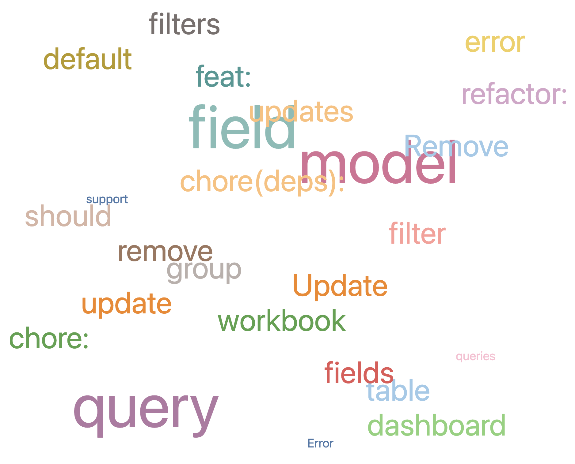
Word Cloud Visualization
{
  "mark": "text",
  "width": "container",
  "height": "container",
  "encoding": {
    "x": {
      "axis": null,
      "field": "HEIGHT"
    },
    "y": {
      "axis": null,
      "field": "WIDTH"
    },
    "size": {
      "field": "FREQUENCY",
      "scale": {
        "type": "threshold",
        "range": [
          20,
          50,
          100
        ],
        "domain": [
          200,
          500
        ]
      },
      "legend": null
    },
    "text": {
      "field": "KEYWORDS"
    },
    "color": {
      "field": "KEYWORDS",
      "scale": {
        "scheme": "tableau20"
      },
      "legend": null
    }
  }
}