
August 31, 2023 - KPI visualizations, row-level permissions, and SQL Server support

KPI Visualizations

A new WYSIWYG visualization type that combines numbers, charts, change arrows, progress bars, text, and more to build flexible KPI tiles.

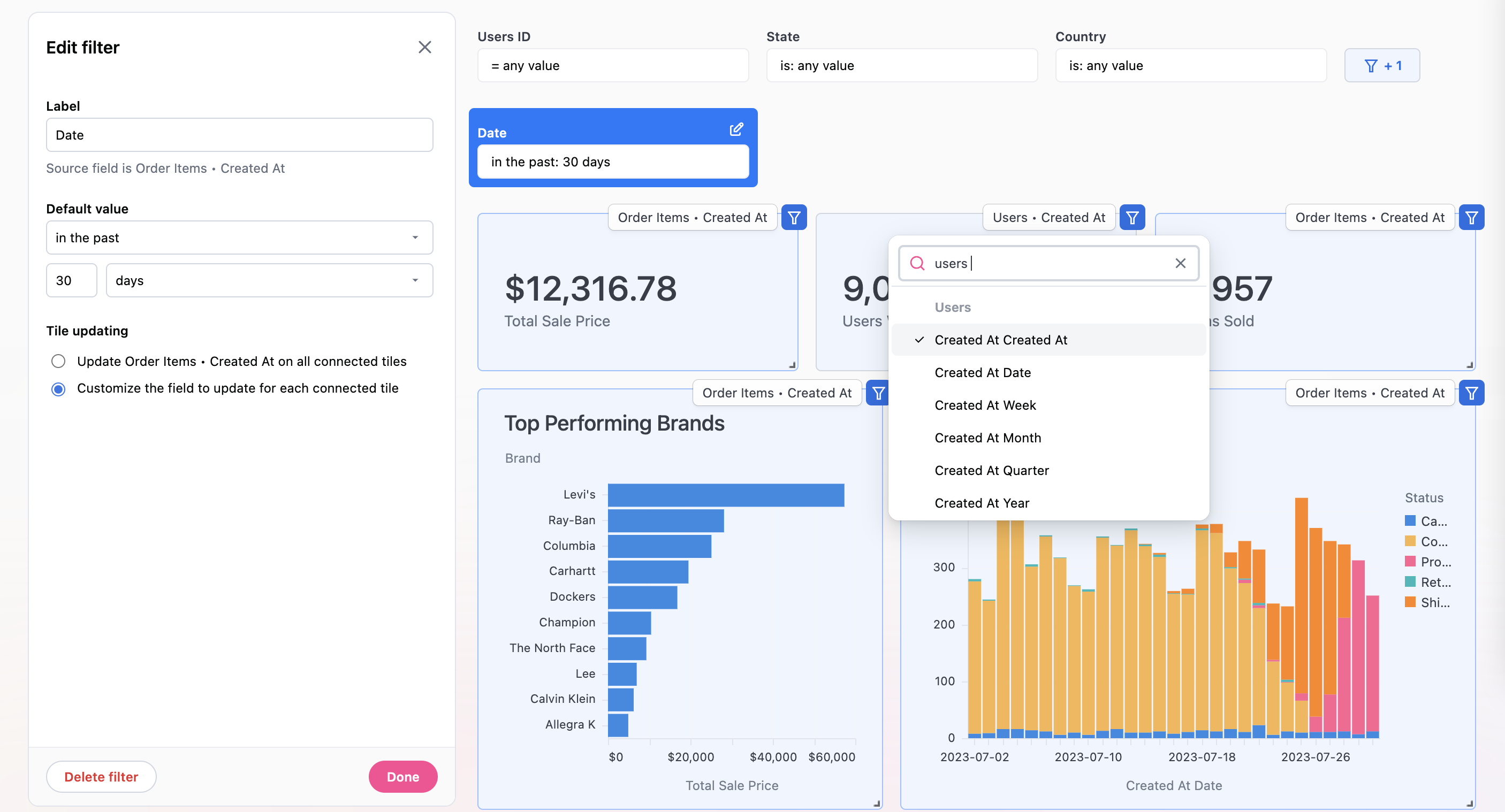
Visualization Timeframe Switcher

Swap out the timeframe granularity directly inside the visualization editor. No more need to go back to the query to change out the field.

Dashboard Edit Toolbar

Getting dashboard tiles sized exactly right is easier than ever with a change to dashboard edit mode. Rather than the edit bar being on the side of the screen, it’s now at the top so the size of your tiles always stays consistent regardless of whether you’re in edit or view mode.

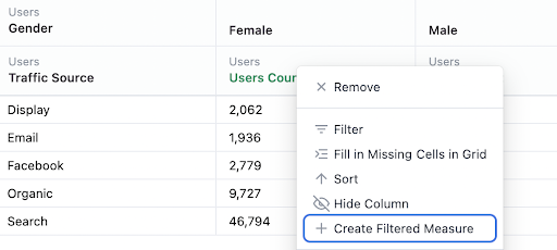
Row-level Data Permissions

With user attributes and a new topic-level access_filter parameter, you can now control what rows of data a user can see. This allows you to build the same query or dashboard, but depending on an individual users’ attribute value, they will only see the rows applicable to them. One example of this in use is if you want to restrict a sales rep’s visibility to only their accounts. Also very useful for serving up analytics to your external clients where you want to build a dashboard once, but ensure each client can only see their rows of data.

Microsoft SQL Server Support

New dialect alert! Omni can now connect directly to Microsoft SQL server.

August 24, 2023 - Drag and drop vis editor, left click actions, and field aliases

Drag and Drop Visualization Editor

Visualizations just got way easier to create and edit with a new drag and drop interaction inside the vis editor.

Visualization Reference Lines

Adding goals or targets to your charts is now possible with vertical reference lines.

More Mustache Markdown Fun

Mustache can now be used in even more places - query elements can be inserted inside chart text (like axis titles) and dashboard filters can be inserted into dashboard text tiles.

Drilling and Context Menus Move to Left Click

While we love a good right click menu… drilling is just too important an action to be relegated to a secondary click. Drilling and context menus are now accessible with left clicks (don’t worry - it still works if you got used to the right-click!)

Field Aliases

Following on the view aliases parameter, fields can now also have aliases. Makes it easy to preserve content when a field name changes in the database.

Other Improvements

  • Control calculation direction for pivots: choose if the calculation should be computed down the column or across the row
  • Date fill for “on or after filters”: dates can now be filled in when an on or after filter is applied, filling rows up to the current date
  • Unpin axis from zero: new Y-axis visualization setting
  • Add existing join to topic: from the workbook join modal, new option to add the join to the current Topic (without having to go to the IDE)
  • Filters can be referenced in dashboard text tiles: call out filter values on a dashboard using mustache syntax

August 4, 2023 - Viewer role, filter mapping, iframe in markdown, and visualization improvements

Viewer User Role

New connection permission called Viewer that limits users to only viewing dashboards built on predefined Topics.

Filter Mapping on Dashboards

Filters can now be mapped to different fields on each tile. Especially useful when mapping a date dashboard filter to different date fields on each tile (though not limited to just dates!).

iframes in Markdown Visualizations

Markdown visualizations now support iframes so all your favorite web pages can be embedded right inside a dashboard! They can optionally be parameterized with query elements so they can dynamically change based on the filters or query results. One of our favorite examples is this brand lookup dashboard that embeds a google map of all store locations based on the applied location filter.

View Aliases

Ever had the name of a table change in your database and then all the beautiful content downstream broke? Never fear - the new View aliases parameter is here! When the name of a database table changes you can apply the aliases parameter to the new view name to ensure old content still works.

Other Improvements

  • **Query elements in chart text: **mustache syntax can be used inside chart text elements (axes labels, legend labels, etc) to display query or filter values
  • **Axis label rotation: **visualization axes labels can be rotated to a different angle
  • **Axis min/max: **quantitative axes can now have a minimum and maximum value specified to override the automatically applied range
  • **New global format types: **gdp and eur formats now available
  • **Format precision: **from the table config, formats can have a decimal precision applied
  • **Relabel columns: **from the table config, columns can be relabeled
  • **Invitation request management page: **new admin page to see all pending user invite requests

July 26, 2023 - Scheduled dashboards, text tiles, Markdown, and more

Scheduled dashboards

Dashboards can now be scheduled so you can keep up with your most important metrics from anywhere. We also released new admin and management controls to make it easy to manage all your scheduled content from one central spot, and you can even navigate usage by sender or recipient (to help you curate a seamless experience for folks who aren’t in Omni yet!

Dashboard text tiles

Add text, links, images and more to your dashboard with a new markdown-based text tile.

Markdown visualization

A whole new viz type that makes it possible to create beautiful, info-dense tiles with a combo of text, markdown elements, and query variables. Check out some of our favorite examples:

Read all about Markdown visualization in our documentation

Visualization updates

We’ve made a bunch of viz updates to help you easily communicate results - totals on stacked bars, conditional formatting, and a new color palette picker.

Create filtered measures from pivot tables

Often we want to compare components of a group to the group itself - purchases by region, opportunities by stage, traffic by channel, and so on. Filtered measures make this easy, but they can be tricky to build if you need complex case statement logic (or even don't want to look up syntax). Now, you don’t need to do either because we’ve made it trivial to create filtered measures from pivot tables (shown below) and reference totals for **custom calculations.

Other Improvements

  • **Default_drill_fields model parameter: **global control for defining a default drill path for every measure on a view
  • **Custom view_label parameter on fields: **group fields under a different view label in the field picker
  • Context menus on IDE files: right click on a file in the IDE to save, rename, or delete
  • Pie chart improvements: expose data labels and option to hide the legend
  • **Wide visualization legends: **expand the width of legends for easier readability
  • Log scale for visualizations: change the axis scale between linear or log
  • Expand cells on table: can right click on a table cell to expand the text and copy/paste (useful to see the full contents when a cell is super long!)